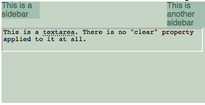
I found myself having to fit a textarea into a space which had user-provided CSS (“skins”) applied to it. This worked surprisingly well, but someone found a skin which had a right-floated sidebar which was playing hell with the textarea, since the textarea needed a fixed width and textareas refuse to overlap floats. So the textare got pushed way down, which looked terrible.
(To make things easier to see, the textarea will be background:transparent throughout.)

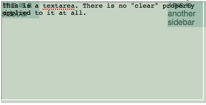
I looked into absolute positioning to solve my woes, and put the textarea in a position:relative div with an appropriate height, and set the textarea to be position:absolute in the top-left of that div. This got me closer.

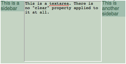
After this I just started fiddling with it. It occurred to me to try overflow:hidden on the textarea’s container, which had an effect I did not expect.

So. Overflow:hidden + absolute positioning + floats = floats not interfering with content. I’m sure this follows rationally from the CSS spec, but I totally didn’t expect the effect.
Further experimentation did reveal that it’s not specific to textareas. Any absolutely positioned content will have this effect if its relative container has overflow:hidden.
Identical effect in: FF3, Chrome, and IE8. Not tested elsewhere yet.
You can see all the CSS involved on this demo page.
(@cheald says that it looks like a variant on Pup’s Box Flow Hack. I’m just happy to have independently stumbled onto something that weird.)